Cornerstone Bible Church Branding Vision: “A Spot for You”
This identity is built around a clear, meaningful idea: you belong here. The bold wordmark establishes strength and clarity, while the distinct “O”—a warm, rounded shape—becomes the central symbol of invitation. It’s not just a design element. It’s the spot. A visual cue that says: this place was made with you in mind.
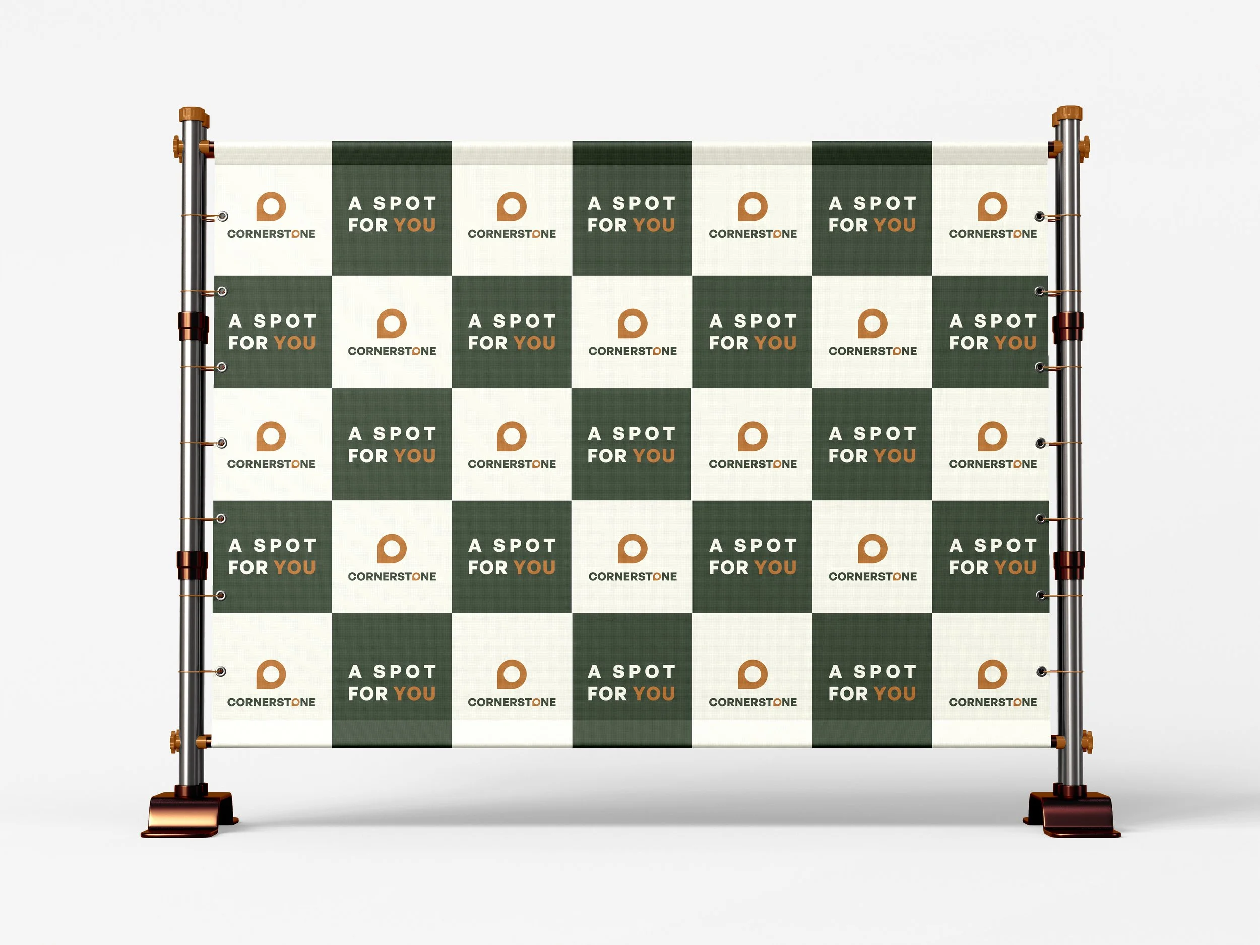
The tagline “A Spot for You” reinforces that message. Whether interpreted as a literal place to sit, a spiritual home, or a role in the body of Christ, it drives home the point: Cornerstone isn’t just grounded in truth, it’s open and ready to receive.
The tone is modern, approachable, and intentional. The mark is flexible enough for everything from signage to social to apparel—always pointing back to the same idea. This is more than a logo. It’s a welcome.