Love Church Branding Vision: “Love at First Sight”
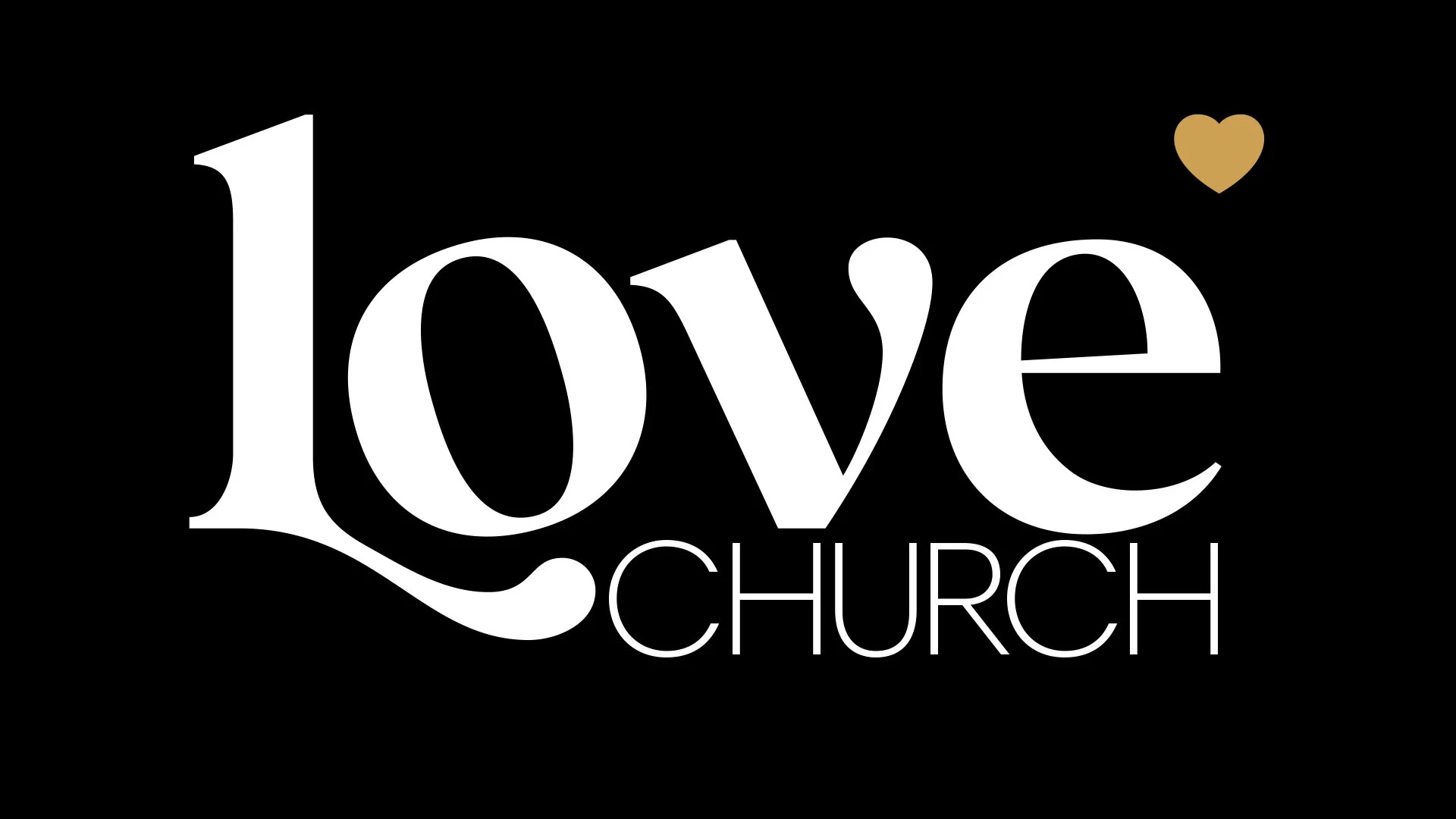
The Love Church brand is bold, minimal, and rooted in clarity. At the center of the system is a single idea: lead with love. The heart becomes the defining visual—anchoring the wordmark, standing strong on its own, and instantly conveying warmth, safety, and belonging.
Typography balances tradition and simplicity. Bigola Display brings presence and elegance to the logotype, while Harmonia Sans supports with a quiet, modern tone. Together, they mirror the mission: truth with grace, strength with approachability.
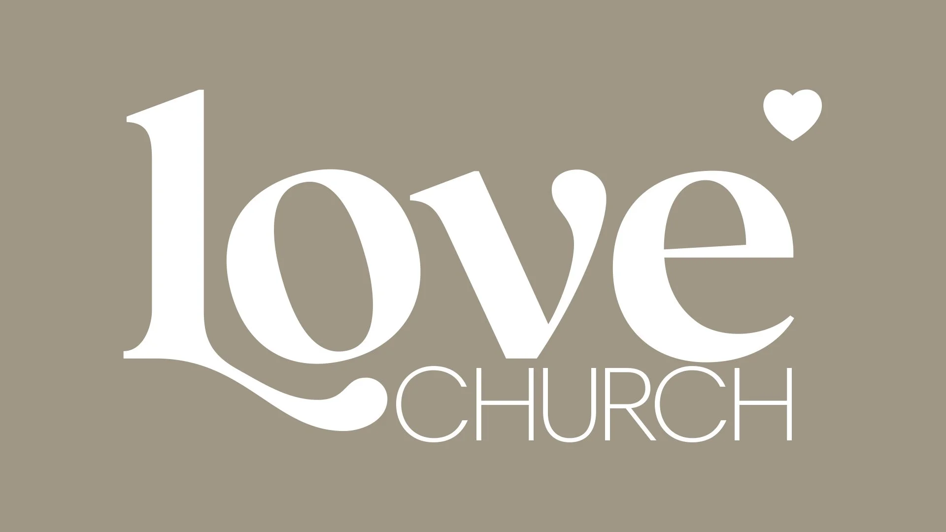
The color palette is tight and intentional. Black and white ensure legibility and confidence. Sundance—used only for the heart—adds just enough warmth to make the message stick. Wool stays in the background, grounding materials with a soft neutrality. There’s restraint here by design—every color and type choice earns its place.
From full lockups to tertiary marks, the brand flexes across environments while staying unmistakably recognizable. Whether it’s .love, Love San Diego, or a standalone “L❤️ve” icon, the message stays the same: this is a place where love leads.