Rincon Aerospace Branding Vision
Precision, Forward Motion, Confidence
The Rincon Aerospace brand was designed to communicate technical excellence, confidence, and forward momentum without unnecessary noise. At its core is a disciplined visual system that reflects how aerospace work actually happens: intentional, engineered, and built to perform under pressure.
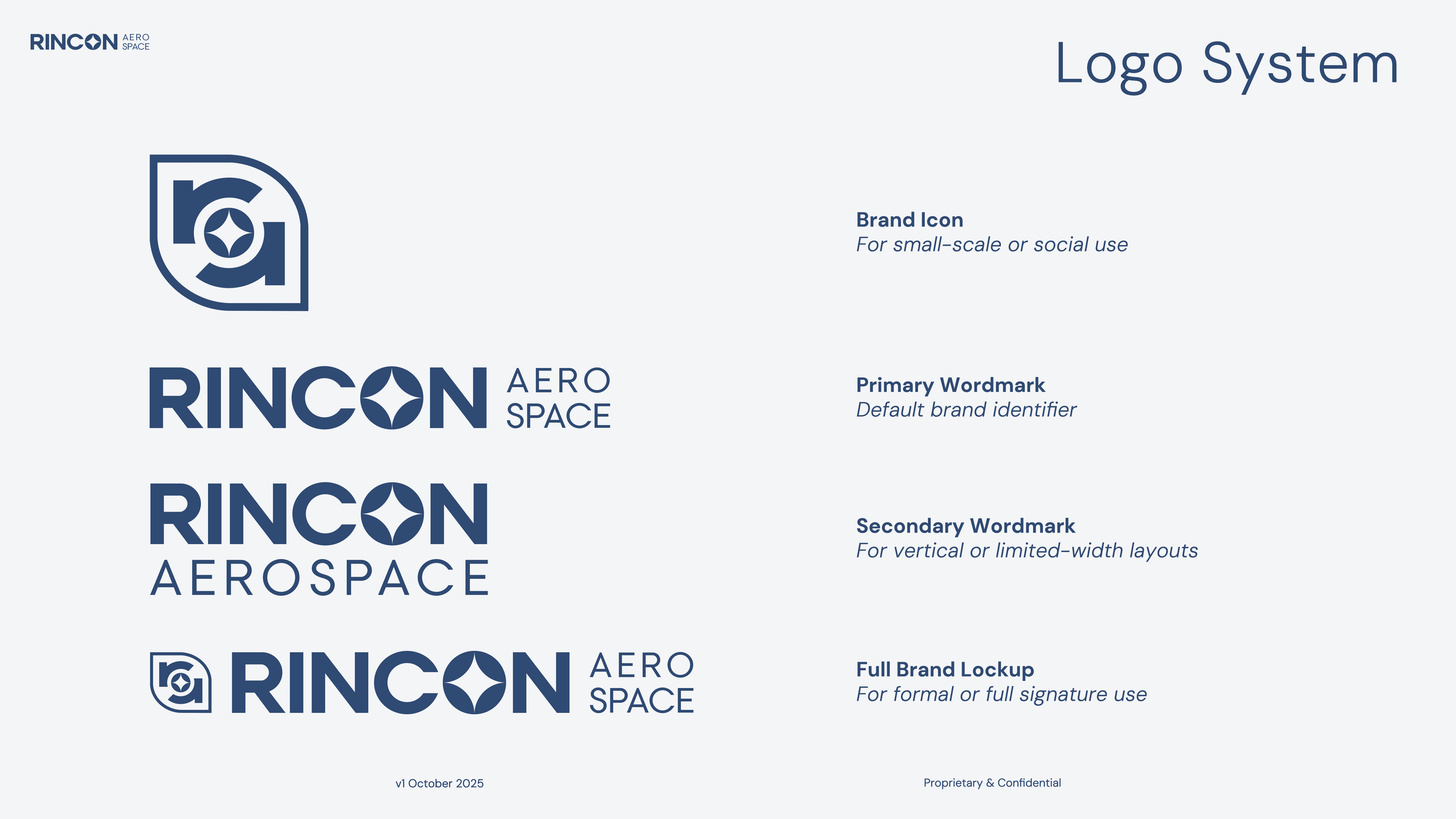
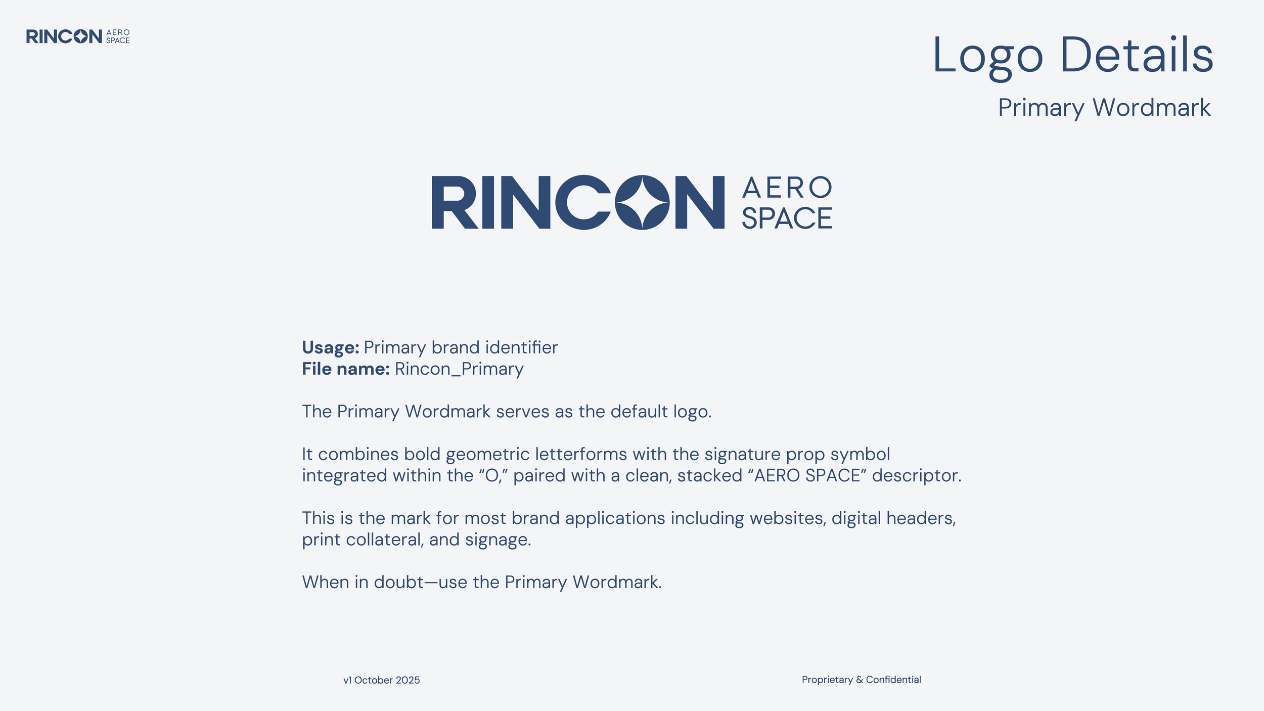
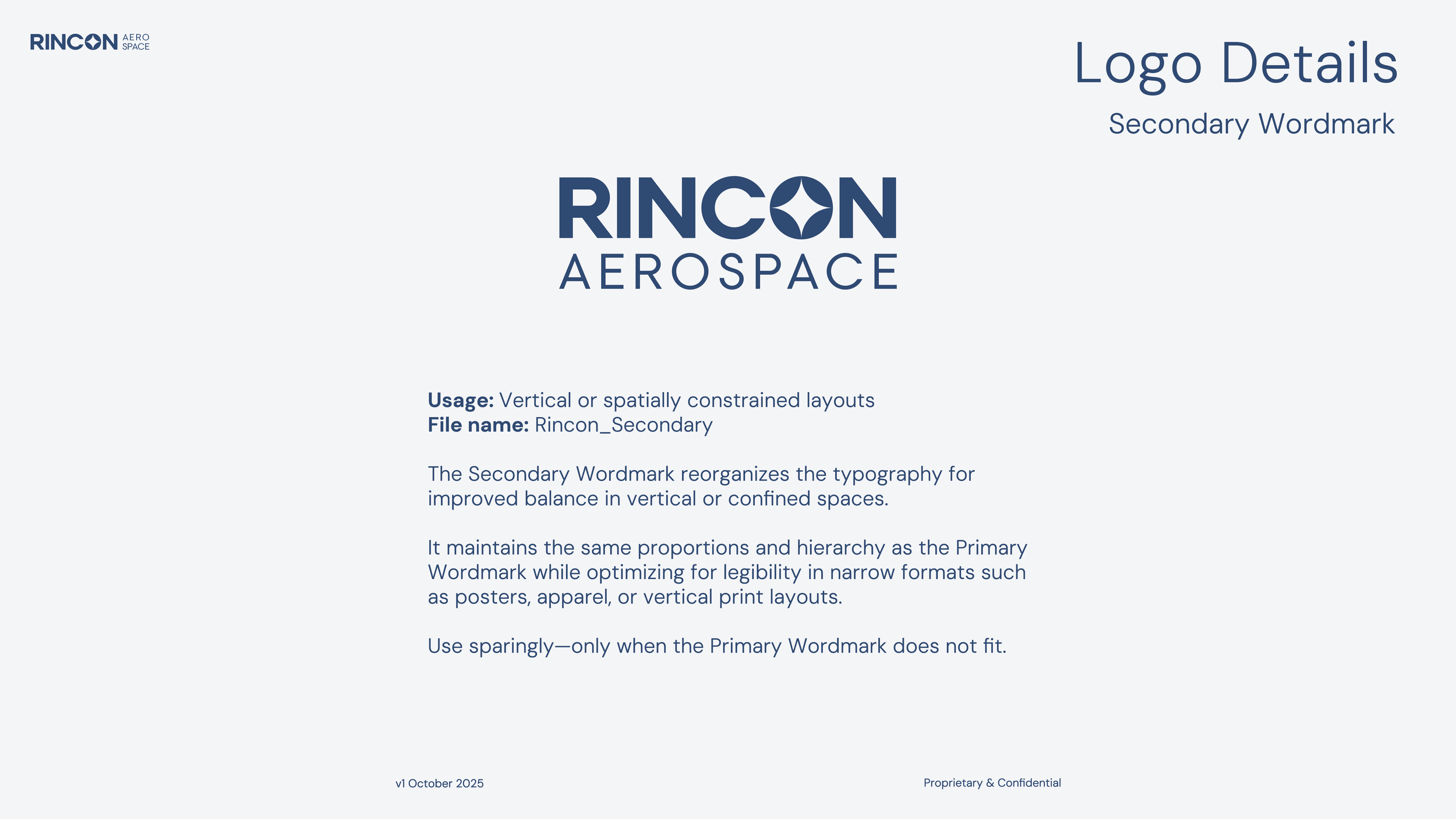
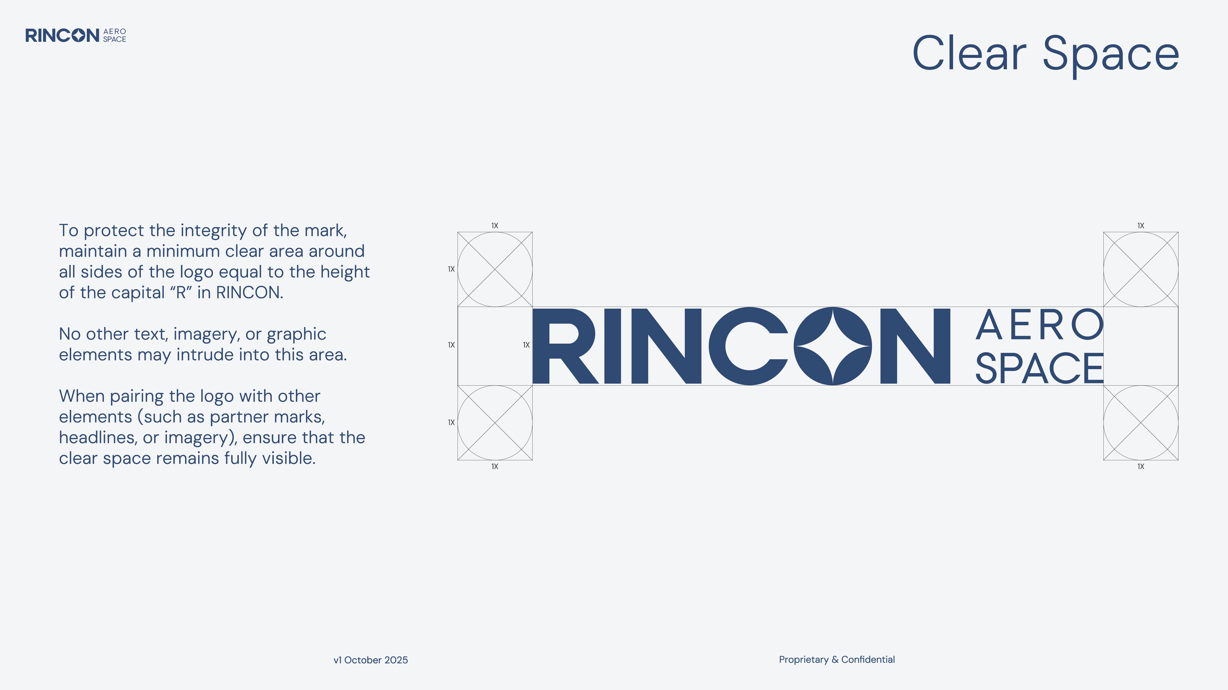
The identity centers on a custom wordmark and brand icon that fuse geometric structure with motion. The integrated propeller motif embedded in the “O” acts as both a functional symbol and a conceptual one—representing movement, precision, and constant advancement. It’s minimal by design, allowing the mark to scale confidently from small digital applications to large-format, high-stakes environments.
The color palette balances authority and restraint. Flight Blue establishes trust and professionalism, while Sky Blue and Stratos White introduce clarity and openness. Copper Horizon and Desert Sand are used sparingly to add warmth and human touch, grounding the brand in both innovation and place. Typography reinforces this balance: strong, engineered forms paired with clean, readable supporting type for clarity across technical and public-facing communications.
The result is a brand that feels calm, capable, and intentional. Nothing is decorative. Every element earns its place. Rincon Aerospace presents itself as a company that knows where it’s going—and has the systems, discipline, and vision to get there.