Rincon Horizons Branding Vision
Exploration, Perspective, Forward Thinking
Rincon Horizons extends the Rincon Aerospace brand into a more reflective, exploratory space. Where the parent brand emphasizes precision and performance, Horizons is about curiosity, long-range thinking, and the ideas that shape what comes next.
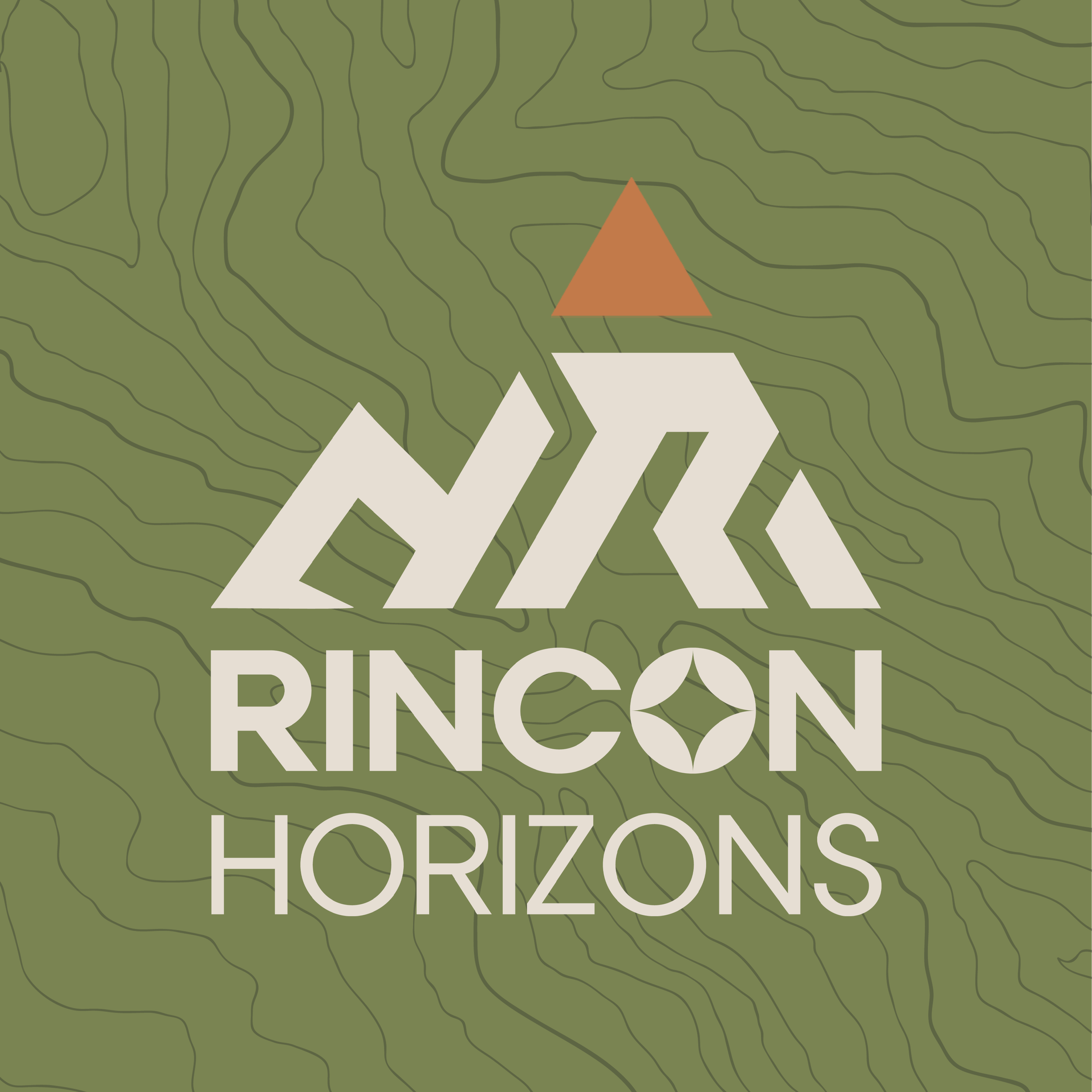
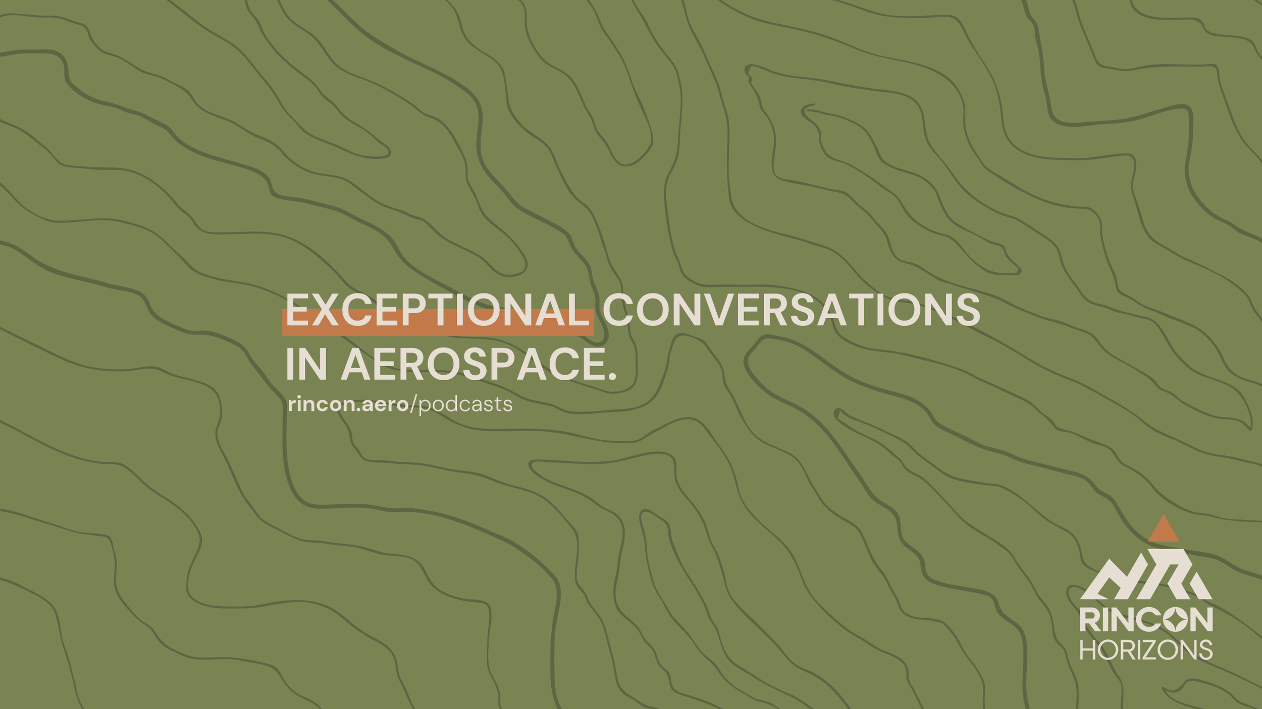
The identity draws from navigational and landscape cues—topographic lines, horizon markers, and simplified geometric forms—to evoke exploration and depth. The abstract mountain-like symbol and upward-pointing marker reference both physical terrain and conceptual elevation, reinforcing the podcast’s role as a place for perspective rather than promotion.
The color palette introduces warmth and earthiness while remaining disciplined. Muted greens and natural tones ground the brand, signaling thoughtfulness and credibility, while the restrained accent color creates a clear focal point without overpowering the composition. The system feels intentional and calm, designed to invite listening rather than demand attention.
Rincon Horizons is visually distinct but strategically aligned. It feels human, curious, and expansive—an intellectual counterpart to Rincon Aerospace’s technical rigor.