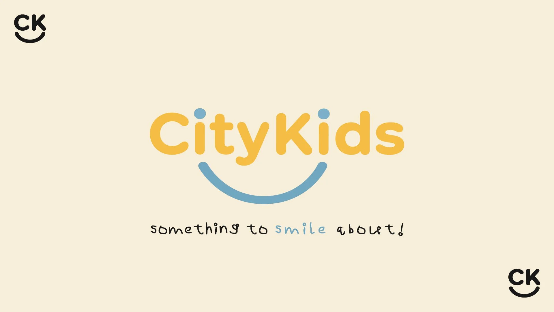
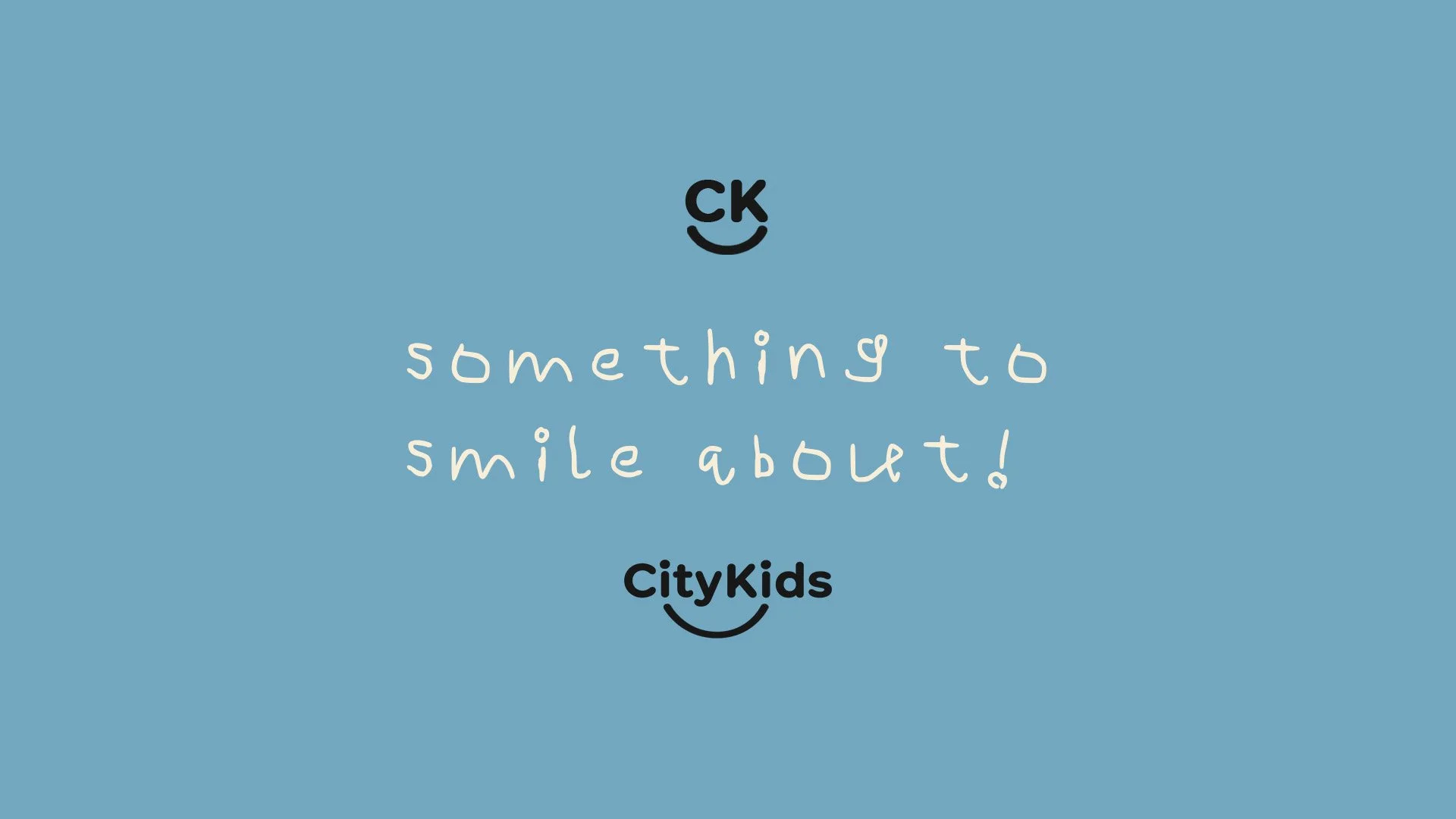
CityKids Branding Vision:
“Something to Smile About”
The CityKids brand was designed to be instantly joyful, irresistibly approachable, and unmistakably kid-forward. At its core is the smile, both literal and symbolic. The curved smile element in the logo doesn’t just reinforce friendliness, it becomes a visual signature that ties everything together, from the ‘CK’ monogram to the playful typography.
I embraced soft, cheerful colors, rounded type, and kid-like hand drawn lettering to communicate warmth and fun without sacrificing clarity or professionalism. CityKids looks and feels like a place where every child is welcomed, known, and celebrated.
The tone is light and energetic but anchored in thoughtful design. From signage to social posts, every visual touchpoint reinforces the same idea: CityKids is a place where kids belong, and that’s something to smile about.